Unmatched
UX/UI Design

Project Overview
Discovery & Background
Unmatched was created by my Cherry on Tech squad to help learners with marginalized identities entering the Science, Technology, Engineering, and Mathematics (STEM) field conquer imposter syndrome. I interviewed users to inform our early iterations and digital product features.
Design & Brand Identity
Our squad discussed several constraints and considerations that helped shape key design decisions, such as having only frontend engineering capabilities for our MVP. We were able to clearly identify our branding after defining our product vision, target market, and product functionality to convey our purpose and help empower our users.
Usability Testing
After completing our MVP high-fidelity designs, I led our squad's usability testing with 5 participants and gained insights into future iterations of our product. We learned of three categories to focus our efforts to make improvements to the value proposition and usability of our responsive website.
My Contributions
Role
UX/UI Designer
Research
Tools
Figma
Figjam
Slack
Github
Duration
3 months
I worked on an agile cross-functional tech squad consisting of a Product Manager, UX Writer, and three Developers, where I led the design process.
Project Scope
01 Discovery
02 Brand Identity
-
Problem space research
-
Personas
-
User story mapping
-
Color pallet
-
Name & logo
-
Design system
03 Ideate
04 Testing
-
User Flows
-
Wireframes
-
Prototypes
-
Usability Testing
-
Insights
-
Next Steps
Agile Timeline

01 Discovery
Imposter Syndrome Research
I assisted our Product Manager in conducting initial research with potential users to understand what digital products already exist for helping with imposter syndrome, exploring features that users would actually turn to in times of feeling isolated, anxious, and like a fraud, which are common symptoms of imposter syndrome.

Low-fidelity Prototype
I created a low-fidelity prototype to explore multiple features with users and gain insight into their interest using it to combat imposter syndrome. The initial design exploration sought to assess whether:
01
Users want to learn about imposter syndrome,
02
Users find value in receiving curated resource suggestions,
03
Users would utilize suggestions for overcoming imposter syndrome.

Four Key Research Insights

Identifying Product Constraints
Frontend Engineering Limitation
Our tech squad was focused on creating our MVP using frontend engineering only. This limited the amount of data we could store, ruling out the ability to include user portfolios.
Not a Social Media Platform
Similarly, we clarified we would create a static website and would not be able to provide a social media user experience due to time and engineering constraints.
Lack of Mental Health Expertise
We determined our collective experience lacked the expertise necessary to share ethical and accurate information to users about mental health and emotional impacts of imposter syndrome.
Defining the Product
Once we gathered insights from users and understood our engineering capabilities, we could begin defining what our product would include to help our users conquer imposter syndrome.
Unmatched Voices
Our squad wanted to provide resources to our users to help them overcome imposter syndrome, and our users wanted relatable stories to connect with. We collectively curated 13 biography stories of modern-day STEM leaders of color and marginalized identities, along with two resources related to the leaders that would help empower users.

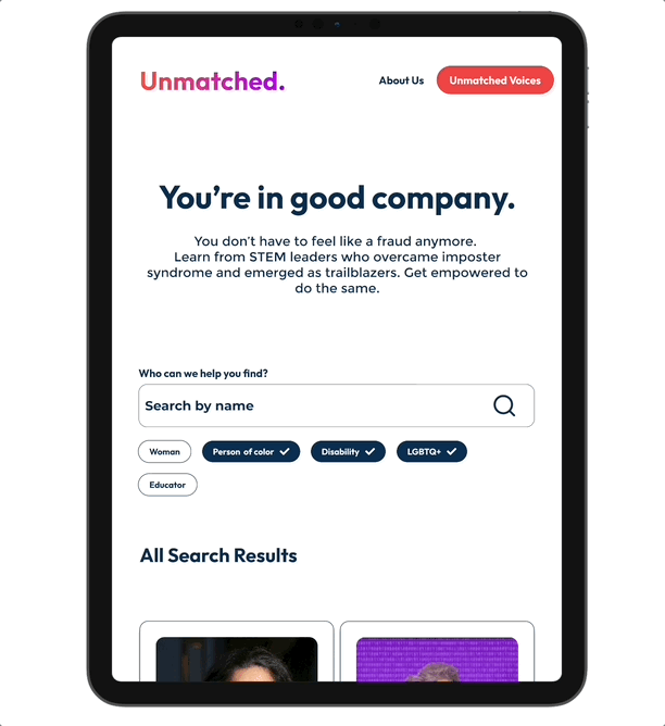
Resource Search and Filtering
Even though we were not able to include a profile feature, we wanted to deliver the ability to connect with resources through personalized filtering and search options. Our users have the option to search for a STEM leader, filter based on identities they connect with, or scroll through our powerful collection of Unmatched Voices.
Affirming and Encouraging Messaging
We wanted our users to gain resources and affirmations that they are not alone in their experience of feeling imposter syndrome. While we are not mental health experts, we believed our users would benefit from validating statements, which is why we included these bold statements throughout the website.

User Story Mapping
After defining our target users, development constraints, and exploring how to empower users to conquer imposter syndrome using digital tools, we embarked on mapping key features of our product to deliver valuable resources to help conquer imposter syndrome.


02 Brand Identity
Foundational Elements
During this phase of our design, I collaborated with another UX Designer to bring the vision and voice of our product to life by selecting elements that would convey our uplifting message and inspire users to explore the the product offerings.
Color Palette
Vibrant, colorful, uplifting, and empowering were all themes our squad wanted to embrace and share with our users. As we began exploring a variety of colors, we narrowed our palette to 6 lively, rainbow inspired options, and from there identified how we could use them strategically to meet WCAG accessibility guidelines.

Unveiling Unmatched & Logo Design
The design team came up with the powerful name for our product and I used our color pallet to create an electric visual addition.

Design System
Our engineering team would be developing using the Tailwind UI kit. I used the complementary Tailwind UI kit through Figma Community to assist in creating a simple, yet powerful, design system.


03 Ideate
User Flows
Before I began wireframing, I wanted to create an understanding of how our users would enter our website, map out what elements they would use to navigate and how to accomplish the task of obtaining relevant resources.

Wireframes
During the wireframing process, I learned about Figma’s powerful auto-layout tool, which was instrumental in crafting organized cards. Users experiencing imposter syndrome may come to the website already feeling overwhelmed and anxious, so I wanted to be intentional and thoughtful as to how to provide quality content in an easily digestible format.
01 Bringing wireframes to life with branding

02 Iterating on designs to accommodate real content

Prototype
I continued to iterate on the sizing, styling, and accessibility of the wireframes before turning them into prototypes. The prototype was instrumental when passing the designs off to the development team during the sprints so they could preview the component functionality, understand the page connections, and provide feedback to continue making meaningful improvements. I played a vital role in addressing developer questions during the sprints, meeting design deadlines to accommodate the developers’ timeline, and collaborated with our UX Writer to ensure the copy was finalized for the hand-offs as well.

04 Testing
Usability Testing
During our final sprint, the design team tackled a significant step in our process, which was to test our prototype with users to understand KPIs such as, usability and intuitiveness, participant likes and dislikes, how likely users are to return to the website and/or recommend it to others.
5 Participants Interviewed

Affinity Mapping Participant Data

Research Insights
Users of Unmatched shared helpful information about their experience, which can directly impact the value proposition of our product and overall make the website more useful.
60%
of participants expressed they would not read all or most of the text throughout the website, and specifically on the bio page.
80%
of participants suggested having more engaging content, such as the ability to schedule meetings with the STEM leaders, more videos, and read more personalized questions included in the bio section.
"It's easy to focus on the task at hand; there's not a lot of extraneous information here." - Participant feedback
Next Steps
Based on the insights we identified through our affinity mapping process, Unmatched has potential to make a significant impact on our users with a few meaningful improvements. Our squad is not going to continue iterating on the MVP at this time, but may return to this project in the future. Stay tuned!
01
Users want more options for engaging with the webiste,
02
Users need more search filters, including a career category filter, and
03
Users want direct, scannable text with clear calls to action.
Now that you know how we created this website, go check it out! https://unmatched.onrender.com
