Kenworthy Machine
UX/UI Design

Project Overview
Business and Design Goals
The business transitioned ownership in March 2023, which prompted the need for a thoughtful rebrand and implementation of user flows within the website.
Research
In the first round of the website design, the owners wanted to focus on targeting purchasing managers who would convert to new customers, and crafting a pathway for prospective employees to learn about career opportunities.
Design and Testing
Wireframing and prototyping was critical throughout the design process to help communicate the vision and direction of the website to the business owners, and to facilitate usability testing.
My Contributions
Role
UX/UI Designer
Product Designer
Research
Tools
Figma
Figjam
Slack
Jira
Duration
6 months
This began as a solo design project and evolved into a cross-functional collaboration with a team of volunteer developers. I worked closely with the business owners to carry out the design and testing phases.
Project Scope
01 Research
02 User Interface
-
Competitive Audit
-
Personas
-
Brand Identity
-
Logo Updates
03 Ideate
04 Testing
-
User Flows
-
Wireframes
-
Prototypes
-
Usability Testing
-
Insights
-
Next Steps
01 Research
Competitive Audit
Through the initial competitive audit, I compared 8 local machining companies in Washington state, from small to large international businesses, to learn about their service offerings, online user features, and branding.

Audit Findings
88%
of local machining companies display their machine capabilities online, or show examples of products they've created for customers.
63%
of local machining companies allow their customers to request a quote through their website.
50%
of local machining companies utilize their website to recruit candidates to fill career opportunities.
Summary
The Kenworthy Machine website was not offering as many benefits to prospective customers and employees as compared to the local industry, due to its lack of information about machining capabilities, submitting a quote, and providing career information to attract applicants. Including these simple but significant updates would bring the website offerings up to the current industry standard, and provide a foundation for future features.
Personas

Problem Statement
Customers and job seekers are unable to obtain necessary information from the Kenworthy Machine website in order for them to complete a task such as, initiating an order and submitting a resume for consideration. Additionally, users must complete supplemental steps of calling the company to make inquiries to complete their goal. These are problems for the user and the company as it creates delays that could impact conversion rates.
Solutions
01
Users should be able to learn about the services Kenworthy Machine provides and what they can expect to receive as a customer.
02
Customers should be able to submit a request for a quote and receive follow-up contact from the company.
03
Prospective employees should be able to learn about the company's values, benefits, and job openings through the website.
02 User Interface
Brand Identity
The business owners were excited to update the brand through and updated color palette, logo, and voice communicated through the website.
Colors
Considerations: the owners selected a preferred color palette to work from, and wanted to have a bold presence. I tested the color palette against the WCAG standards to create a brand that would be accessible and powerful.

Typography
Considerations: the owners like the boldness of the current typeface, so I used that as a guide to modernize the typography and create a meaningful scale to enhance the readability.

Logo Updates
Considerations: the current logo was simple and purposeful, but did not tell the audience who or what the company serves. I was able to update the logo with the new color pallet so they could continue to use this design, and supplemented it with a more descriptive option.

03 Ideate
User Flows and Site Map
After researching, crafting personas, and establishing a brand identity, I was able to utilize these foundational elements to start building user flows and identifying the structure of the website. I prioritized inserting user flows for each of the personas and ensuring users would be able to get their needs met from each page of the site.


Wireframes and Prototypes
I used Figma to draft wireframes and prototypes throughout the design process. These tools were critical in creating a platform to increase communication and gathered feedback from the business owners to ensure the designs align with the brand vision, voice, and features the owners were striving for.
Key Design Decisions
Displaying Machining Capabilities
I utilized a carousel on the home page to allow users to preview the machine cards, and provided a full page to display the machine cards so they could easily scroll through the numerous options.

Request A Quote From Any Page
One of the key functions of the website is to convert users to customers by encouraging them to submit a quote. With a form and clear call-to-action on each page, the user can accomplish this goal from anywhere in the site.

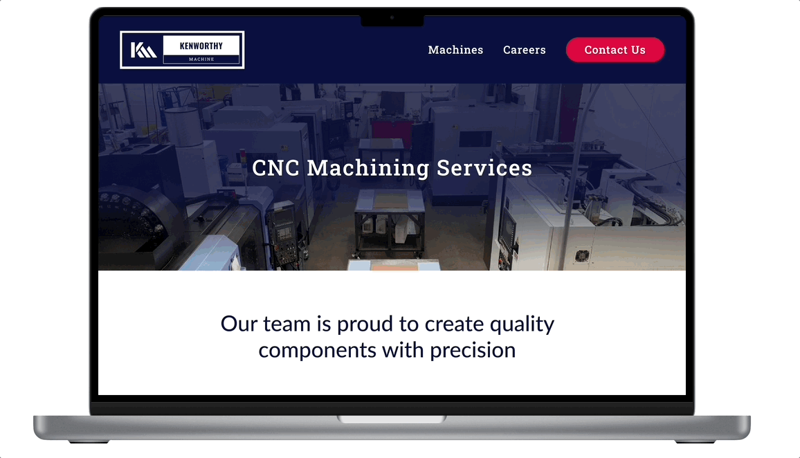
Clear Navigation
The navigation bar at the top of each page was designed to be simple, scannable, and quickly inform the user of the available information throughout the site, such as Machines, Request A Quote, Careers, or Contact Us. Buttons were designed using the vibrant red to attract the users attention and guide them to complete the task of submitting a quote or applying for a position.

04 Testing
Usability Testing
After creating a medium-fidelity prototype, I wanted to test the assumptions about the overall usability and navigation. Key performance indicators (KPIs) included task success rate, error rate, and feedback from users.

Usability Testing Outcome
I moderated the usability interviews with all seven participants and recorded each session for ease of note-taking and future referencing. Using the notes, I began affinity mapping in Figjam to understand the main themes.
Theme 1: Improving Request a Quote Feature

Theme 2: Content and Navigation Improvements

Informed Next Steps
Participants shared terrific insights which helped shape the design decisions moving forward for the final design iterations, which gave the owners confidence in the user flows that I created. Before moving on to development, I made the following changes to improve the user experience:
"Contact Us" -> "Request A Quote"
Users asked for the “contact us” button and page to reflect “request a quote” as users interpreted the purpose to be for customers to submit a quote.
More Descriptive Content
All participants interviewed had suggestions for additional content to be featured on the website to make it more personalized to Kenworthy Machine, such as photos of projects completed, more detailed ‘about us’ section, and descriptive details about business offerings and capabilities.
Navigation Updates
Participants wanted to see more navigation options, and expected to find a hamburger menu, home button on the navbar, and for the footer buttons to be the same buttons as the navbar options.